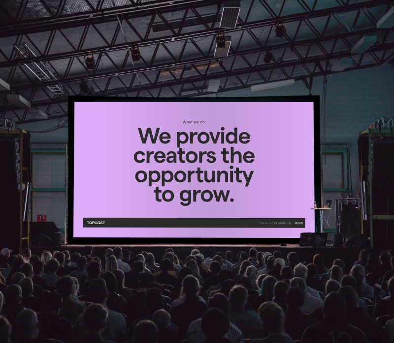
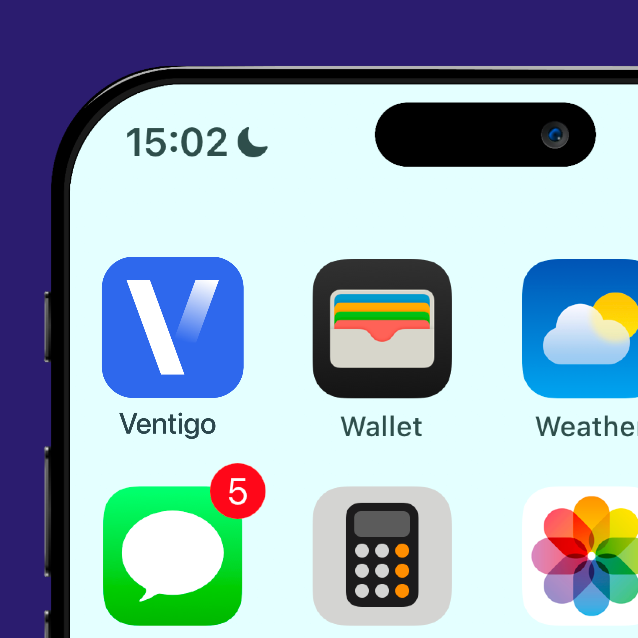
Ventigo. The pros of a clear and scalable brand architecture.
Client
Ventigo
Project type
Go To Market
Services
Brand Concept
Brand Identity
Digital Design
Brand Collateral
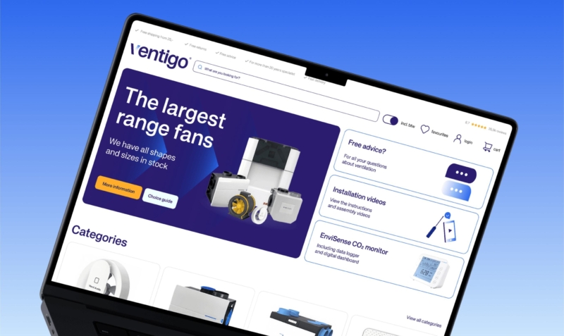
Ventigo is an online specialist in ventilation products, from CO₂ monitors to ducting and complete installation systems. Founder Sebas started with Ventilatieland and quickly claimed a significant share of the market. The formula was simple: the widest range, the best product information. He rolled that engine out across several European countries.
But after years of growth, cracks began to show. Each website had become its own brand, with translated names like Ventilationland and Lüftungsland. Recognition across borders? Non-existent. And internally, servicing and managing all those different countries and brand names was getting harder by the day. The ambition to become Europe's most efficient ventilation retailer called for a different approach.
Challenge
The core task: build one unified, scalable brand that works across all European markets. And that starts with the name.
Ventilatieland and its variants were descriptive, but locked to language. They didn't translate without losing meaning. We needed a name that sounds familiar in every market, rolls off the tongue, and leaves room to grow. Not a literal translation, but a word of its own that signals trust and clarity.
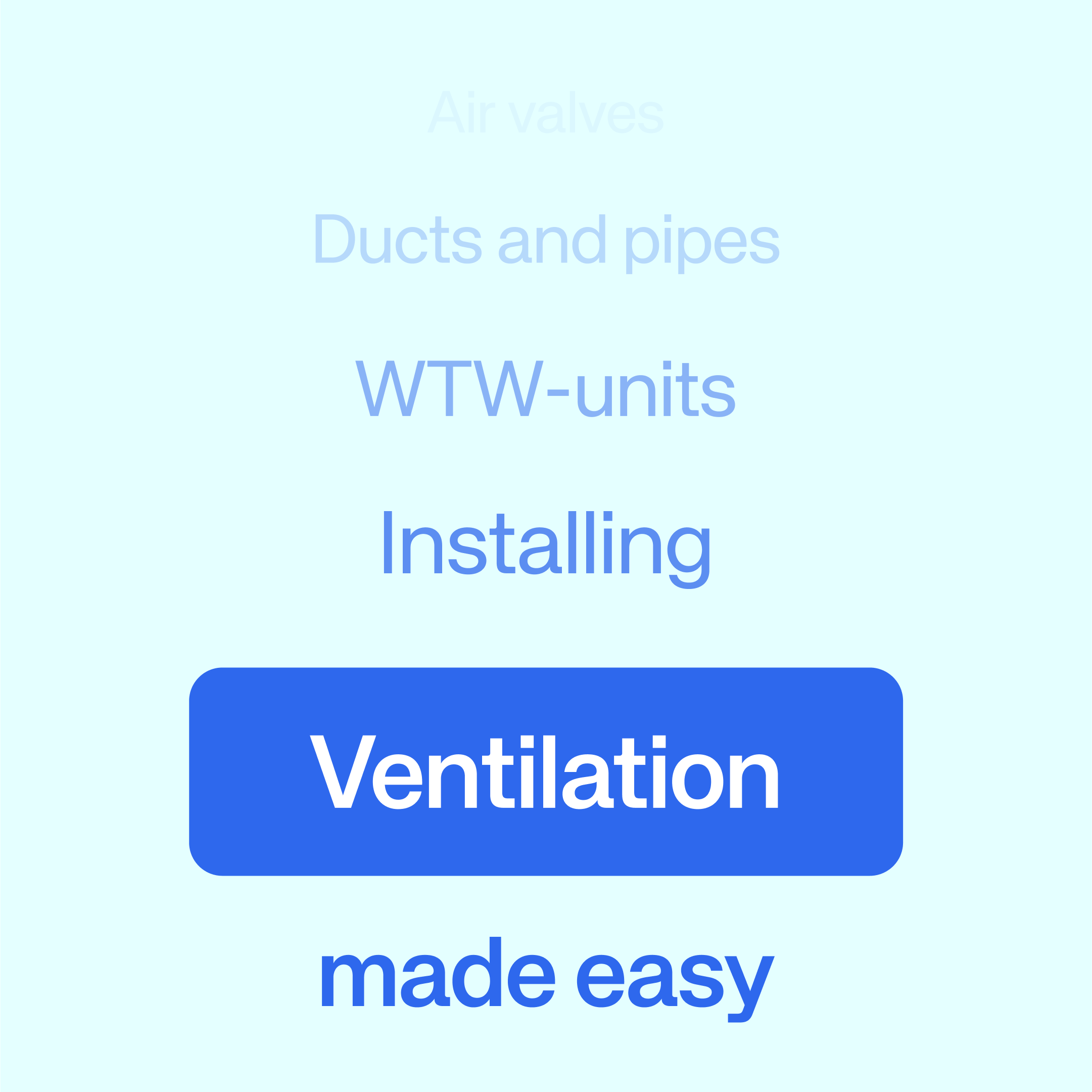
Beyond that, Ventigo needed more than a strong product range. The company wanted to make technical products accessible to professionals and private buyers alike. That calls for a brand that filters complexity and lets customers decide with confidence.
Approach
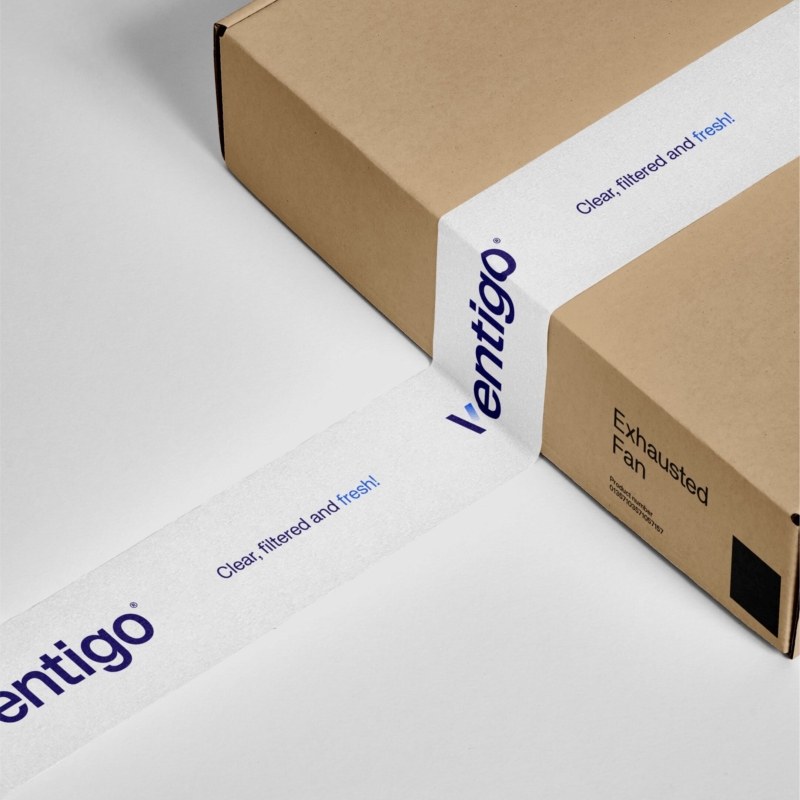
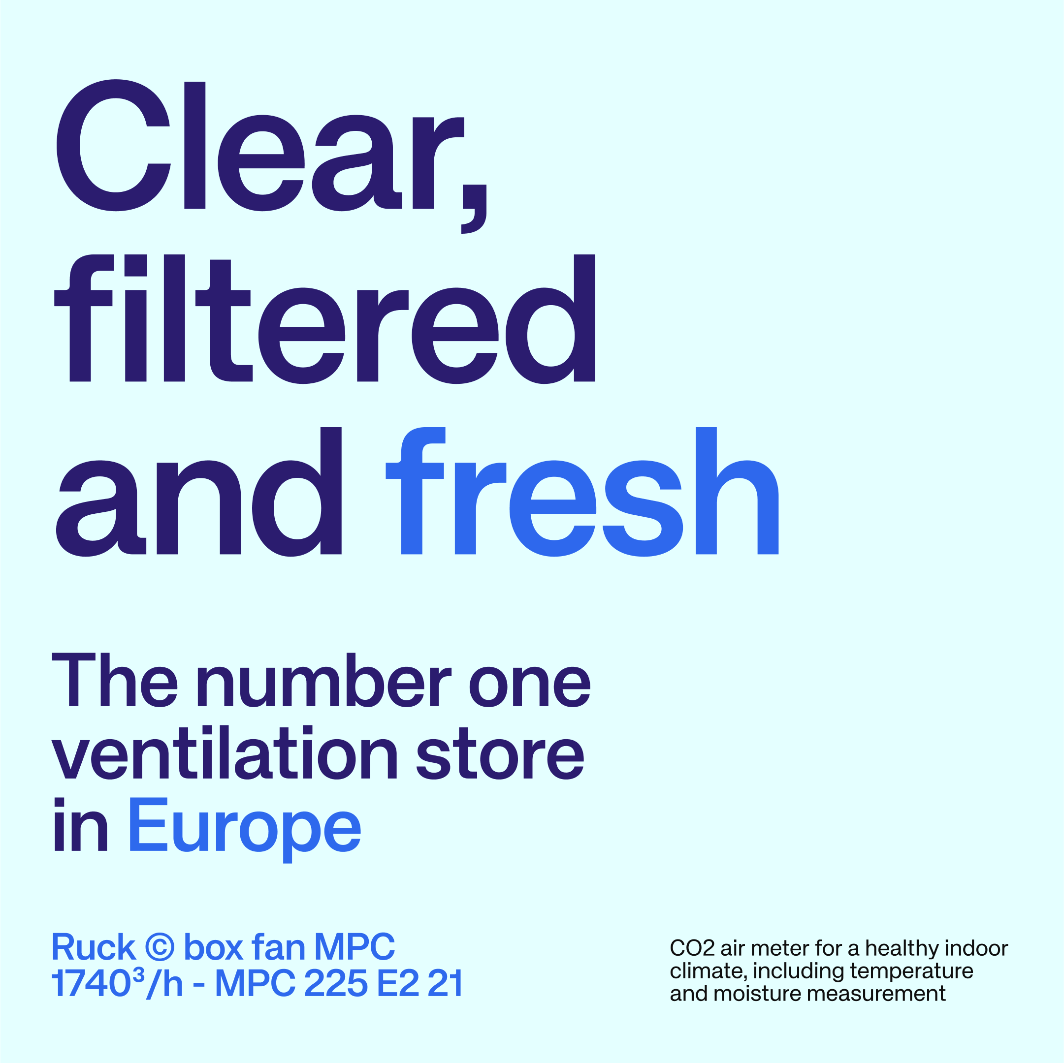
We mapped the needs of digital-native customers and analysed the European competitive landscape. Through strategy workshops, interviews and design sprints, we defined a positioning built on three principles: clear, filtered and fresh.
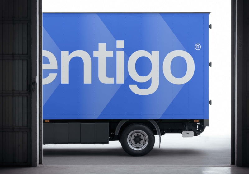
The name Ventigo emerged from that search. Short, Latin in tone, easy to pronounce from Lisbon to Berlin. It feels familiar without carrying existing baggage. It signals movement, air, action.
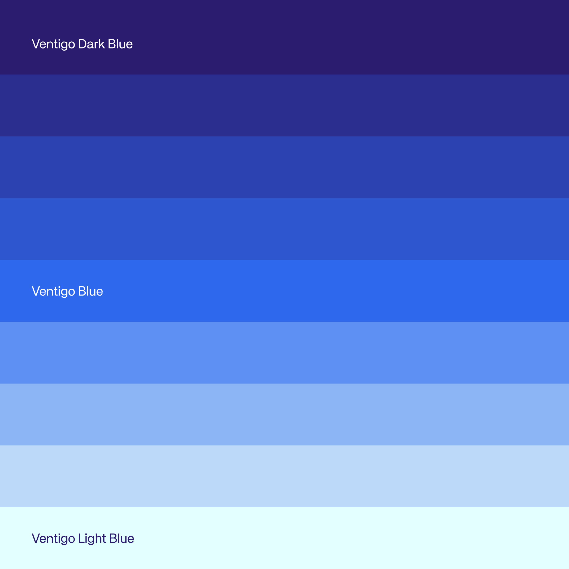
The visual identity followed the same thread. Colour palette, typography and graphic language, all designed for rollout across markets. Every element reinforces the core message: ventilation doesn't have to be complicated.
The tone of voice makes technical information accessible without sacrificing depth. Whether a customer is renovating their home or managing a large-scale installation, communication stays warm, clear and helpful.


Outcome
As a result Ventigo launched as an international brand that makes buying ventilation simple. One name, one identity, ready to scale across Europe. And internally? One brand architecture that grows without added complexity.