Rebranding an architecture firm with a focus on people and structure.
Client
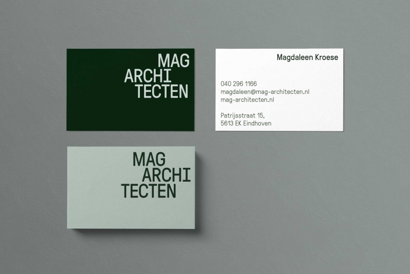
MAG architecten
Services
Strategy
Brand Identity
Digital Design
MAG architecten is at the forefront of design for cooperative living. MAG was founded around 2009 and has been growing ever since. However, their visual identity and online presence didn't change accordingly. Founder Magdaleen Kroese wanted to redefine her brand(story) and showcase her projects more convincingly.
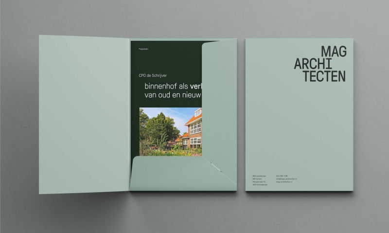
Our challenge was to create an identity that could be a perfect fit for a small company of talented architects while demonstrating their ability to push boundaries within the world of architecture. This new identity tackles both the structural and human approach of their work.
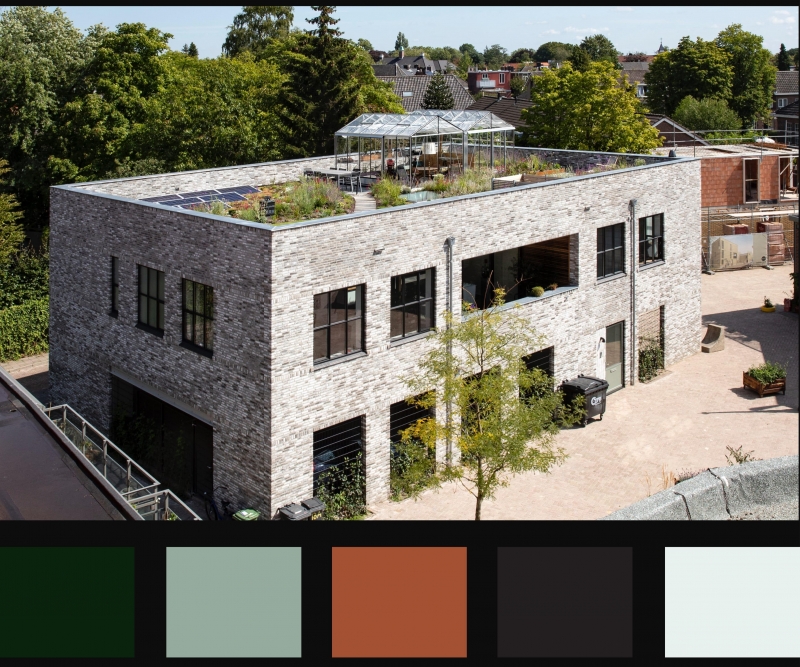
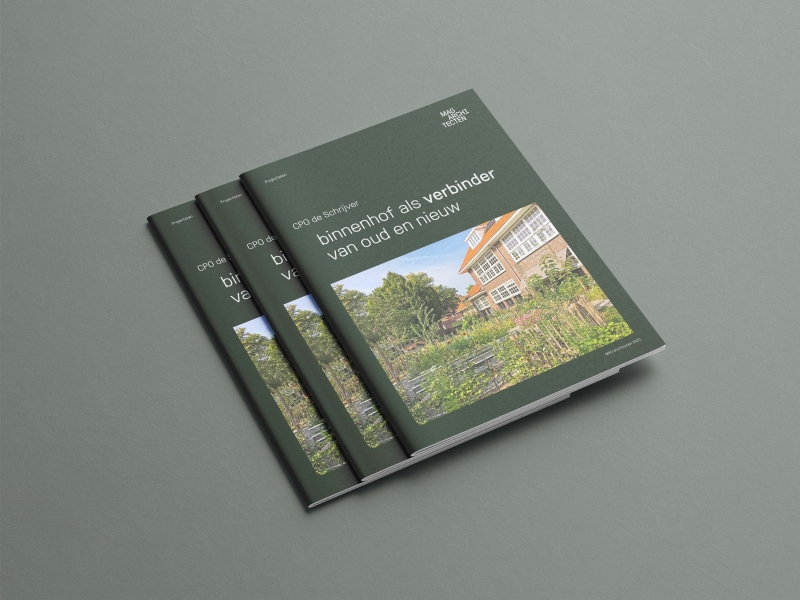
In order to match the digital and physical brand experience we've based the brand colours on the surroundings of MAGs office and workspace. A workspace that Magdaleen Kroese built herself.
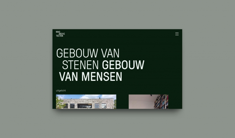
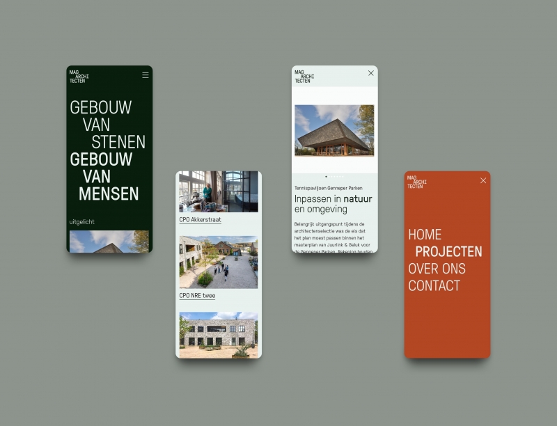
The design system refers to the free configuration of differently sized bricks that occurs in brickwork. Shifting the visual elements without losing the structure shows the creative approach of MAG in finding solutions for challenging projects of all kind.

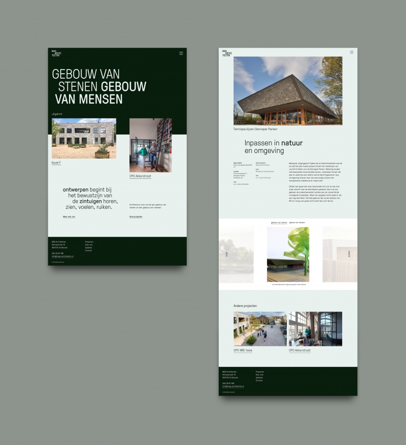
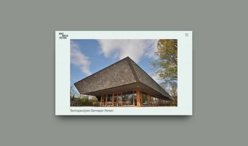
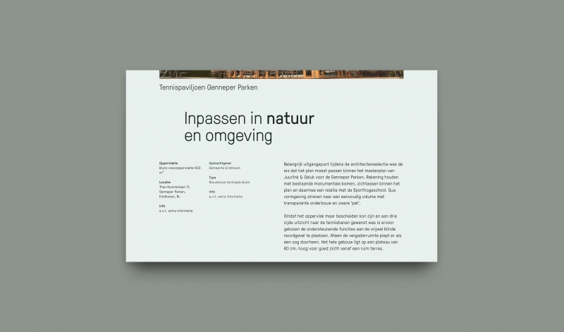
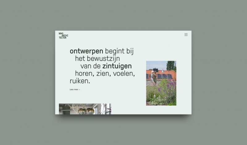
The website includes a clear and effective navigation through the portfolio of MAG. Exterior, interior, technical drawings, scale models, sketches and (3D) impressions have an important place in communicating the work and process that goes in creating such uniquely functional buildings.
"We really enjoyed the refreshing approach of fffunction studio. Resulting in such a beautiful outcome."
Magdaleen Kroese
Get in touch
Want to collaborate on a project like this? Let's talk.


