
“How the hell did they get that out of a bean?”
Project type
Rebrand
Services
Brand Strategy
Brand Identity
Packaging design
Print design
Illustration
Copywriting
Sprout Coffee Roasters is known for its exceptional specialty coffee. With unique micro-lots, experimental flavour profiles and a loyal fanbase, the brand has earned a respected place within the international coffee community. But as the company grew, an unexpected problem emerged. People remembered the animals on the packaging. Not the coffee.
Challenge
Sprout’s packaging system assigned a different animal to each coffee origin. While this created shelf recognition for who knew, it also caused confusion. Customers would return asking for “that coffee with the tiger.” The problem? There wasn’t just one tiger. Sometimes five different coffees shared the same illustration.
The product names and tasting notes were displayed on the back of the packaging, but they played only a minor role in the customer’s decision-making process.
What initially appeared to be a packaging challenge revealed a much deeper issue.
The owners felt that the brand wasn't keeping up with the growth of the business. Sprout is full of personality, expertise and humour, yet very little of that came through in the brand experience. At the same time, the brand struggled to stand out within the increasingly crowded specialty coffee market, while the packaging system offered limited flexibility for future scaling.
Meanwhile, Sprout was on its way to strengthen its position in the growing home-consumption market, where specialty coffee is becoming part of people’s daily routines rather than an occasional indulgence.
Approach
We began with a strategic analysis of both the market and the brand.
Coffee is changing rapidly. Producers and farmers are facing climate challenges, rising costs and geopolitical uncertainty. At the same time, consumers are becoming more informed and more discerning. Great coffee alone is no longer enough; people increasingly expect a brand experience that feels as considered as the product itself.
Within that landscape, we identified an interesting tension.
Sprout roasts some of the most extraordinary coffees you can find, yet it also excels at making exceptional coffee approachable for a broader audience. That balance between accessibility and exploration became the foundation of the brand.
Brand Concept
Sprout moves effortlessly between approachable everyday coffees and bold limited releases. Between a coffee that simply tastes great every morning and one that makes you pause mid-sip to figure out what is happening in your cup.
The brand concept centres around the journey of flavour. From familiar to surprising. From comfort to curiosity. From everyday ritual to sensory discovery.
We love coffee. The kind that makes you stop mid-sip and think: “How the hell did they get that out of a bean?”
That sense of wonder, curiosity and playfulness became the driving force behind the entire identity system.

Solution
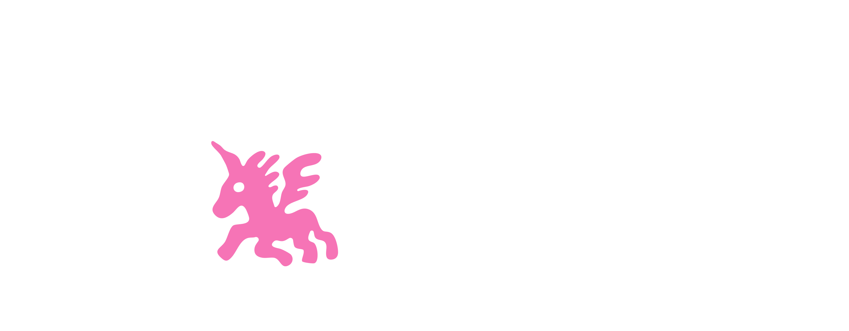
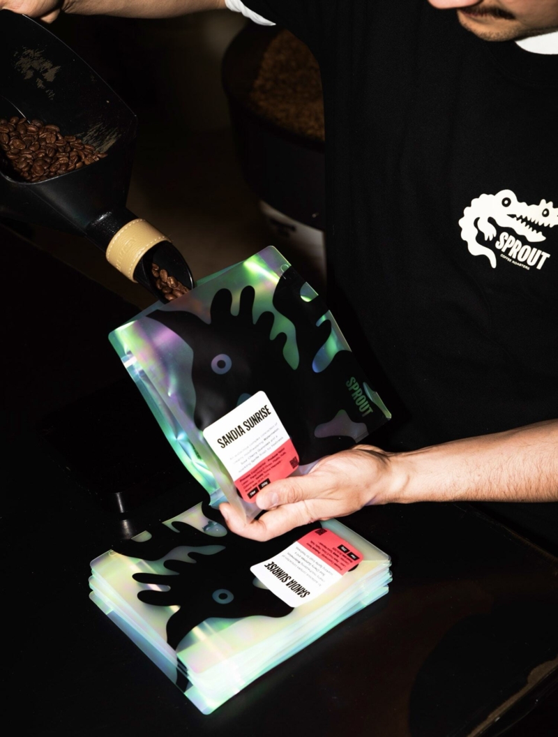
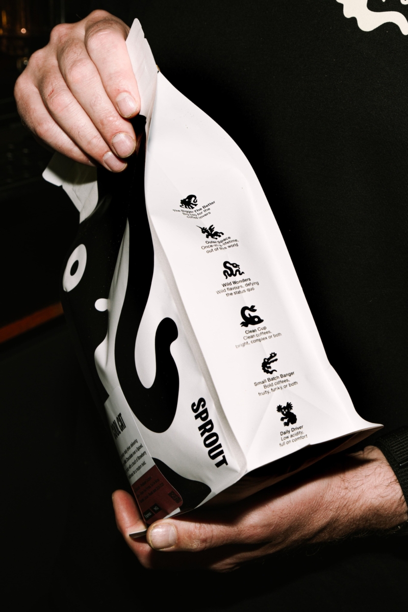
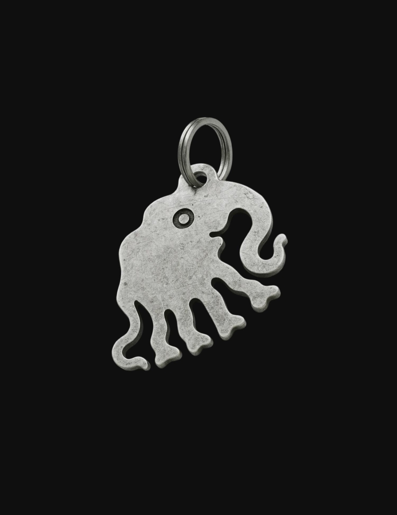
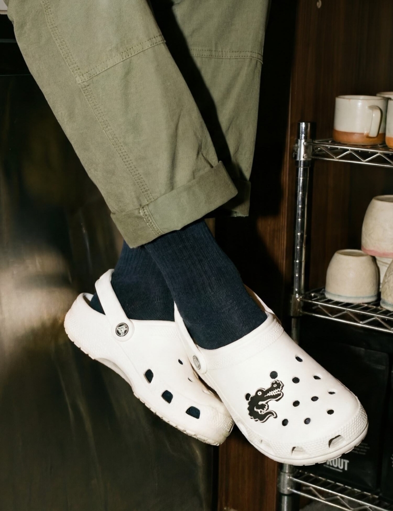
Rather than abandoning the animals altogether, we fundamentally redefined their role. Previously, the illustrations communicated origin. Now, they communicate flavour.
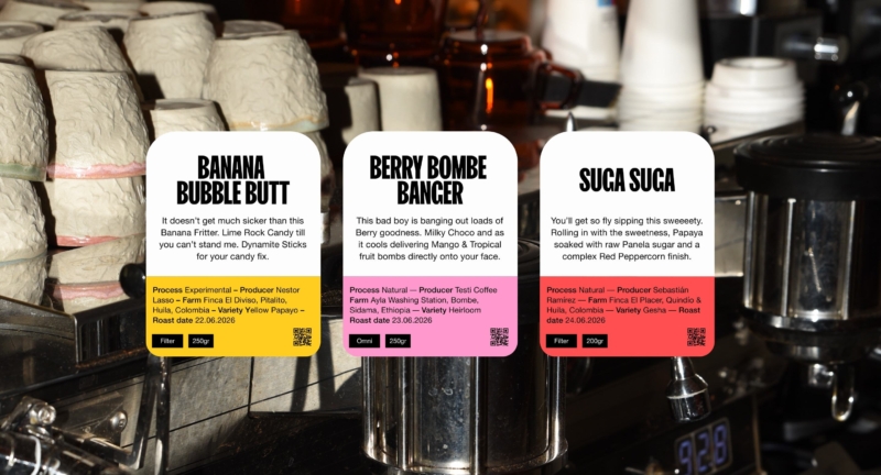
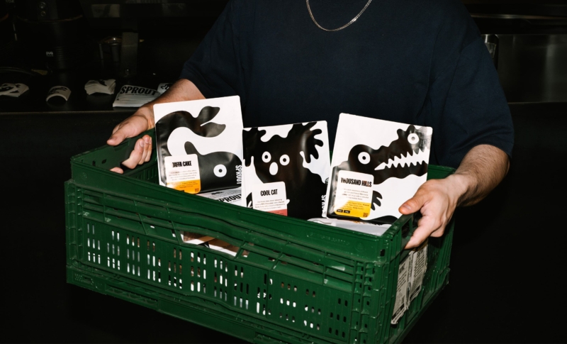
The koala represents approachable, comforting flavour profiles. The unicorn signals rare and experimental coffees. In this way, the animals evolved from decorative illustrations into a practical navigation system that helps customers quickly find their place within the range. At the same time, the product names and flavour stories finally received the attention they deserved.
The owners’ Australian roots were already embedded in names such as Banana Bubble But, Currently Jamming and Judge my Fudge. Full of personality, yet almost nobody noticed them.
By bringing these names and tasting notes to the forefront, we created a brand that starts tasting before the first sip. Because flavour is shaped not only by what we taste, but also by the expectations, curiosity and imagination that come before it.
Outcome
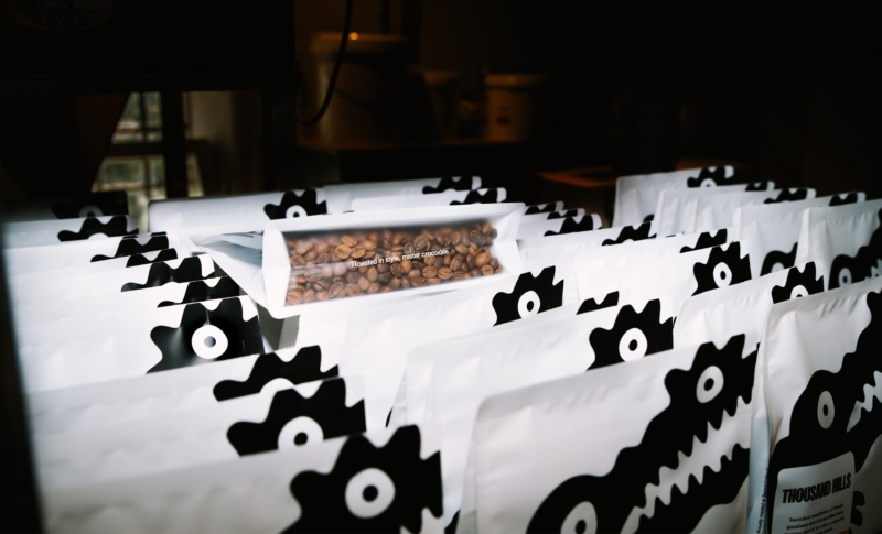
The new identity commands greater attention on the shelf, communicates more clearly what is inside each bag and better reflects who Sprout is today. Where the previous system helped people recognise products, the new system helps people discover flavours.
The result is a more distinctive brand that feels deeply connected to the company behind it. A brand that makes specialty coffee more approachable without losing any of its magic.
Beyond the visual transformation, the rebrand delivered measurable business impact. In the first half year after launch, retail sales grew by 127% compared to the same period under the previous packaging system. Overall revenue increased by 71% year-to-date.
But perhaps the most meaningful result lies beyond first-time purchases.
The new packaging system helps customers find the coffee that fits their taste more quickly and with greater confidence. By making flavour profiles, product names and categories easier to understand, customers are no longer buying based on a remembered animal or a vague recollection of a previous bag. They are choosing the coffee that is right for them.
That clarity has led to a significant increase in repeat purchases. The packaging creates the initial attraction, but the real value comes afterwards. Customers return more often because they can identify, remember and reorder the coffees they genuinely love.
Operationally, the new packaging architecture also simplified production and reduced handling time. A more flexible system allows the team to launch new coffees faster, scale more efficiently and support continued growth without increasing complexity behind the scenes.
What started as a packaging redesign ultimately became a tool for growth, customer loyalty and operational efficiency.
“My mates at fffunction not only helped us regain control of a brand that was no longer representing us, but also created a system that works better for us, sells better on shelves and even makes the same coffee taste better because of the connection people feel with it. We’ve genuinely had customers tell us the coffee tastes better. The coffee didn’t change. The brand around it did.”
Daniell Jansen - Owner at Sprout Coffee Roasters
Get in touch
Have a branding challenge? Let's talk, book a call or drop us a line.